
In this article we’ll delve into the deeper aspects of logo design beyond just visual appeal, emphasizing the importance of a logo’s connection to a brand’s story and its impact on consumers. When you think of successful logo design, the first thing that comes to mind is probably the iconic symbols from businesses like Nike, Adidas, and McDonald’s. But what about the feeling these logos create? Although visually appealing, these logos are also deeply rooted in the brand’s story and consumers. A successful logo goes further than just being a pretty graphic. When working on crafting the best logo for your business, there are five key considerations to keep in mind.
1. Market Research
When starting the process of designing your logo, the first thing you should do is take a look at what is already out there. Market research is key to finding what works and what doesn’t. Not only will you find inspiration, but you will also find what the market lacks. Knowing what your consumer needs will help you create a logo that speaks to them.
2. Alignment with Brand Story
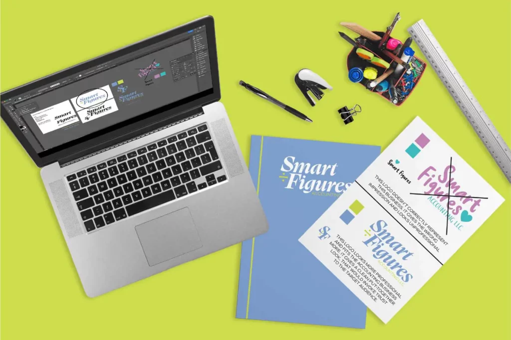
It is easy to get carried away with personal aesthetics, but keep in mind the goal and message of your business. Creating a logo that speaks true to your business’s story will help build trust and identity with your clientele. For example, if our fake company “Smart Figures” wants to be an approachable accounting firm for clients aged 20-35, they will want to choose a logo that speaks to their market and helps identify their brand. A logo is often the first and last thing a client sees when interacting with your business, so it should remind them of who you are and create a building block for the rest of your business to succeed.

3. Logo Application and Adaptability
Another point to consider when designing your logo is what materials your logo will be printed on. Different businesses have different collateral and marketing assets, so identifying what yours will be before finalizing a logo is important. A coffee shop will need to consider mugs, cups, menus, stickers, and a-frame signs while an accounting firm will need to consider letterhead, pens, business cards, and email signatures. Creating a round logo may be ideal for a coffee shop and its assets, but an accounting firm may want a more elongated logo to better fit its needs.

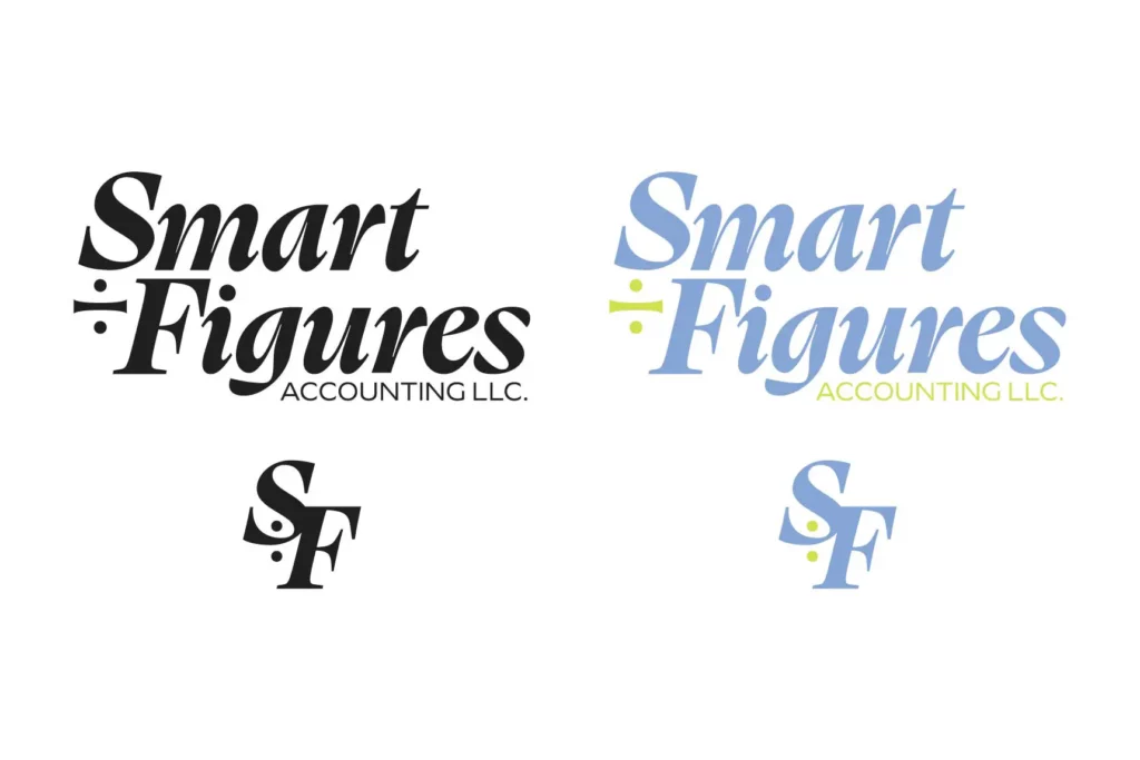
4. Starting in Black and White
When creating your logo, always start the process in black and white. Sometimes the use of colors can sway a logo to look better than it is. Starting in black and white helps you see the logo truthfully, and adjust small details you may have otherwise missed. Designing the logo initially in black and white allows for a clear focus on the design itself without the influence of colors, helping to refine the details effectively.
5. Rebranding Consideration
If you are an established business and have had a logo for 10+ years, maybe consider a rebrand. It is good to give your business a refresh to better fit the times and stay relevant with new clients. Elevate an old logo with an updated color scheme, or a new graphic element, or reimagine it into something completely new. Established businesses should periodically reassess their logo’s relevance. A rebrand, whether a subtle update or a complete overhaul, can revitalize a business and keep it aligned with contemporary trends.

Ultimately, we want to emphasize that a successful logo is more than a visually appealing graphic; it’s a strategic tool that communicates a brand’s identity and resonates with its audience.
Are you ready to redefine your brand’s visual identity? Whether it’s crafting a compelling new logo or refreshing your existing look, our team specializes in creating designs that truly reflect your brand’s essence. Let’s start a conversation about how we can help elevate your brand’s image. Reach out to us today and let’s explore the possibilities together!
If you’d like to learn more about logo design and branding check out our other articles on this topic:
5 Basic Types Of Logos, The Difference Between Logo Design and Branding